A company with years of experience and groundbreaking technologies, Green Light Systems prides itself on its easy to use interface and its primary app that helps users make any kind of list they would ever need. They require their logo to represent their years of experience, along with a sense of wonder for its lower income target audience.
Logo requirements
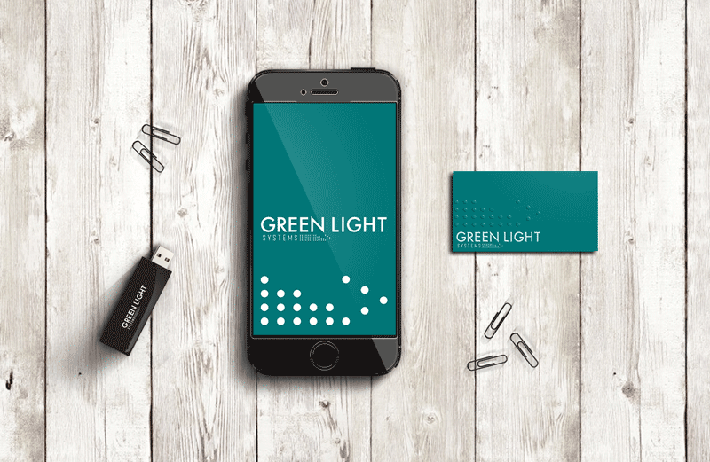
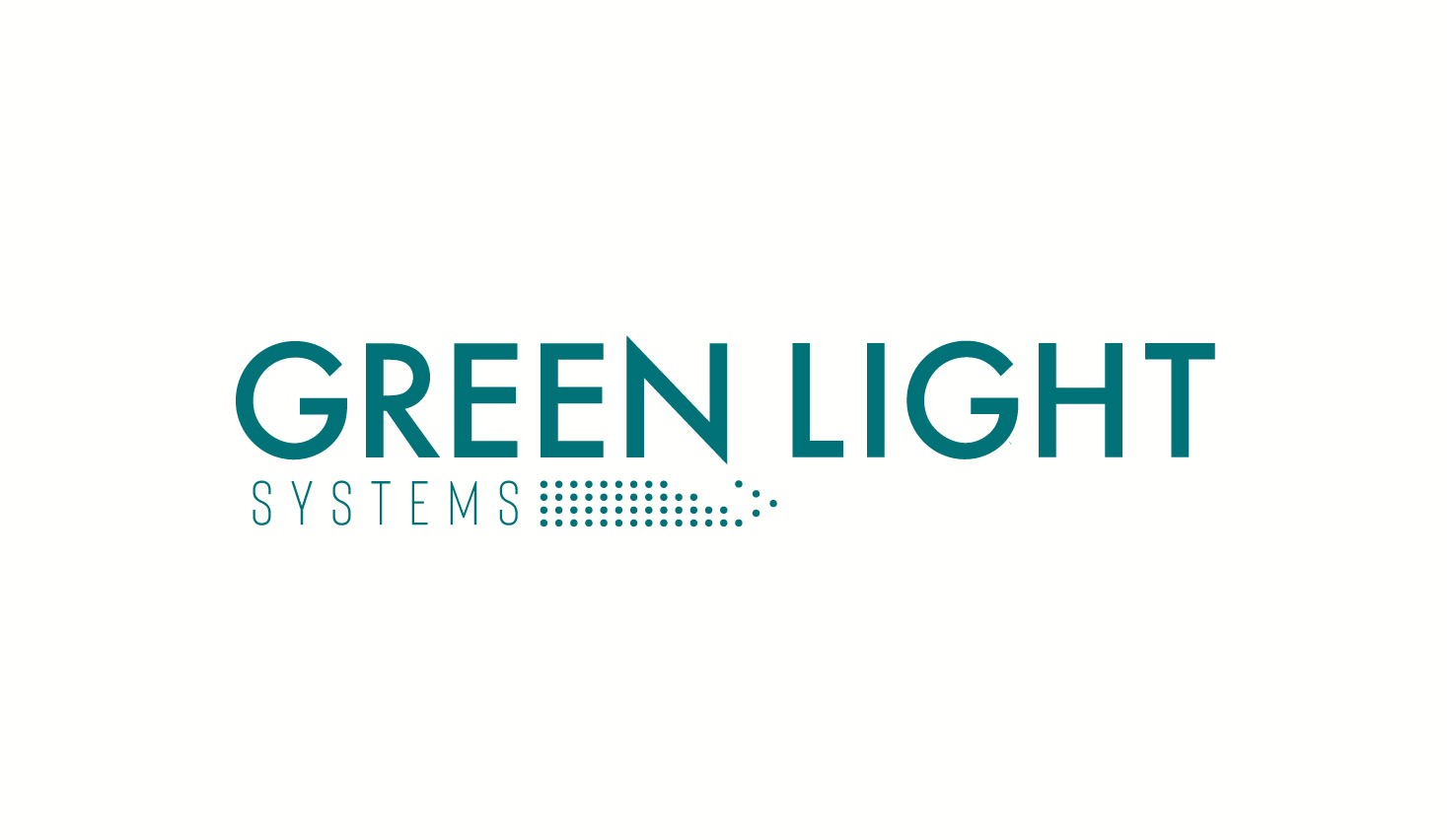
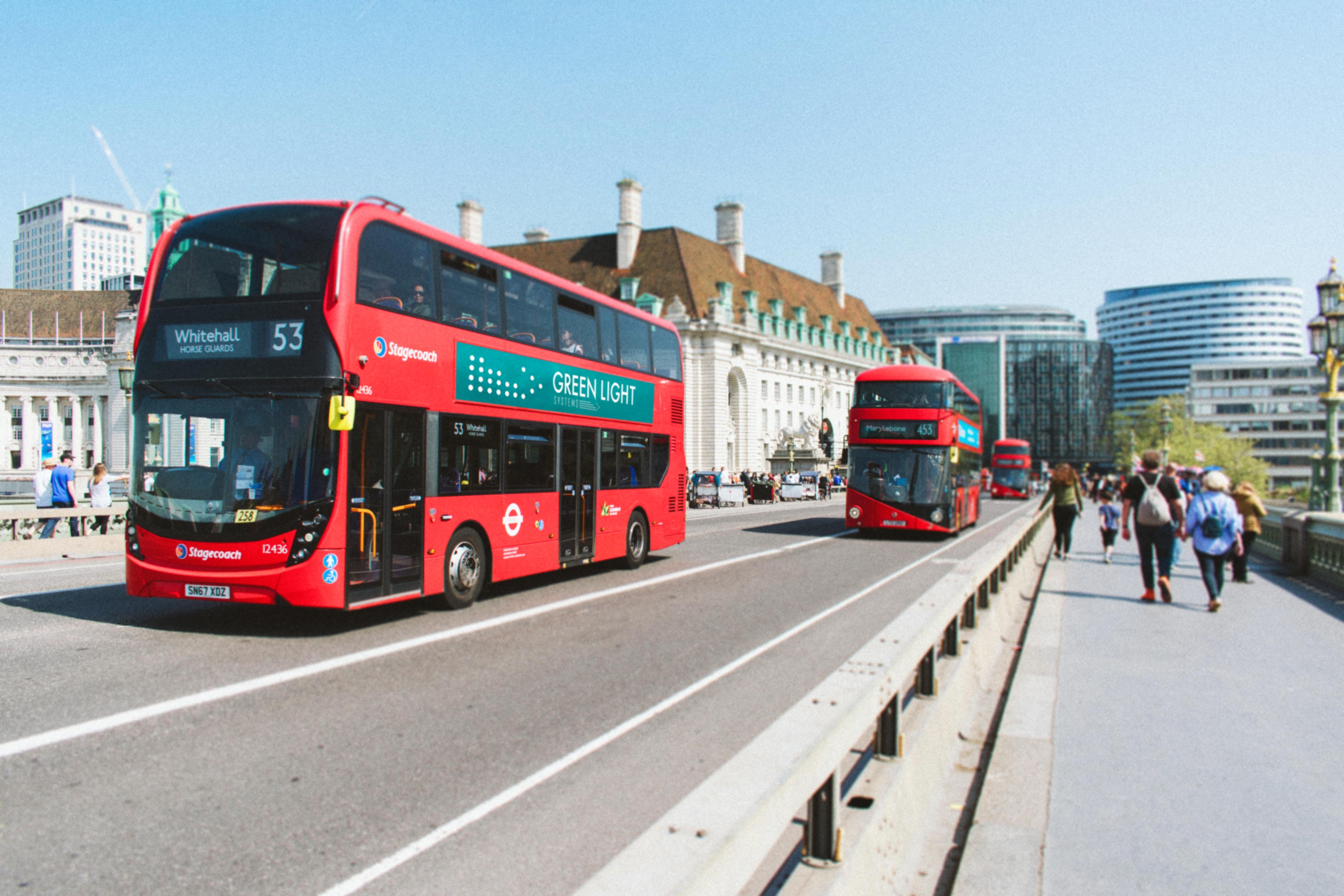
An abstract logo mark that will be appropriate for advertising on sides of vehicles, as well as the digital space such as apps and website. Colour: blue.


Outcome
The final logo was left justified with an abstract pen/pencil built around a series of dots. The particle-like nature of the logo mark provides a solid visual foundation that will allow future designs to present different versions of the mark while still remaining clear and consistent in its identity. It will also provide a flexibility when designing for different surfaces such as vehicles, billboards, name tags etc.
This blue was chosen as it falls in between blue and green, creating a type of bridge between the required colour and the company name’s colour. The shade is also deeper, showing a sense of confidence and wisdom, reflecting the years of experience and older feel of the brand.

Leave a comment