vancouver service jam 2026
type: bRAND IDENTITY, SOCIAL MEDIA
role: sOLE GRAPHIC DESIGNER
software: illustrator, indesign, LIGHTROOM, PHOTOSHOP
Global Service Jam is an event that takes place in cities all over a little over 48 hours, where students, professionals and curious minds descend from all sectors to collaborate, discover, explore, and experiment in the realms of service design.
THE BRIEF
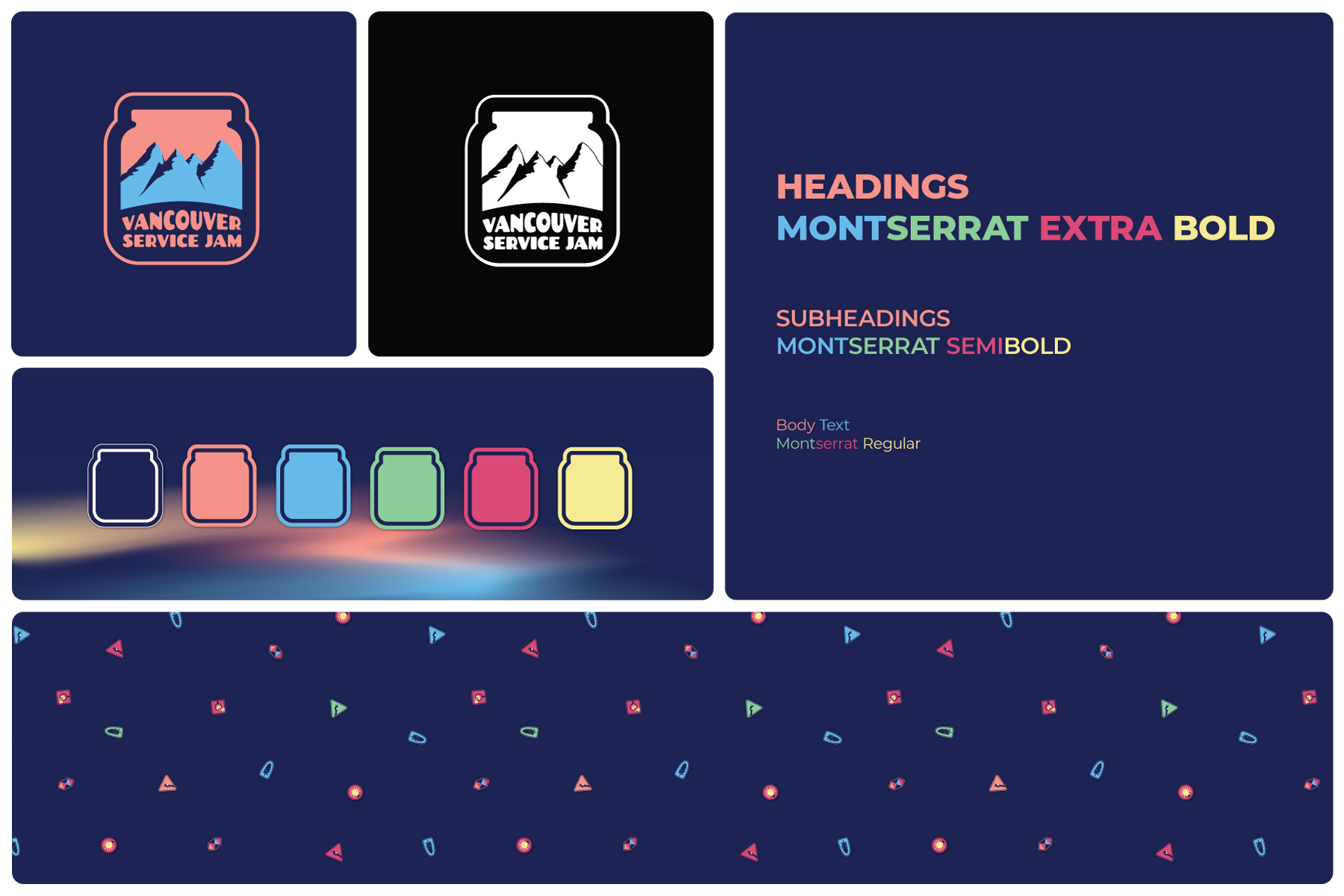
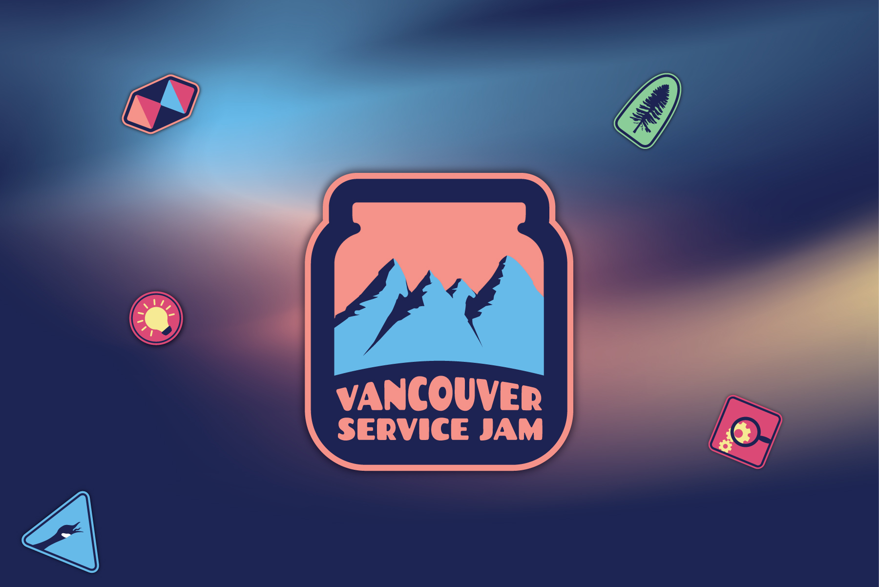
Aside from the precedent that each logo reflect its own cities/culture, the client wanted the logo/identity to embody the sense of exploration, fun and teamwork that makes this experience unique. Additionally, with no colour requirements, the design and system was to be flexible for use across social media, presentations and printed/digital assets, with accessible, free typeface options. Finally, the Global Jam requires all registered jams to have a jam jar in the logo.
THE CHALLENGES
- The most logical representation of the Vancouver land would be art/elements rooted in Musqueam, Squamish and/or Tsleil-Wautut cultures, as someone with no indigeneity to this land, this is not my place, so it was agreed that the logo development would focus on iconic landscapes and abstract approaches.
- The jam jar also posed some initial challenge, but was soon incorporated with purpose—a patch border as well as a ‘looking glass’ to the mountains.
- A solid colour can often feel flat or harsh against the patch style chosen, particularly in smaller areas such as social media posts, and promo posters would more easily blend into the sea of other posters on campus grounds, so a gradient background was added to the identity system, using the existing brand colours to create a sunrise sky effect.
THE OUTCOME
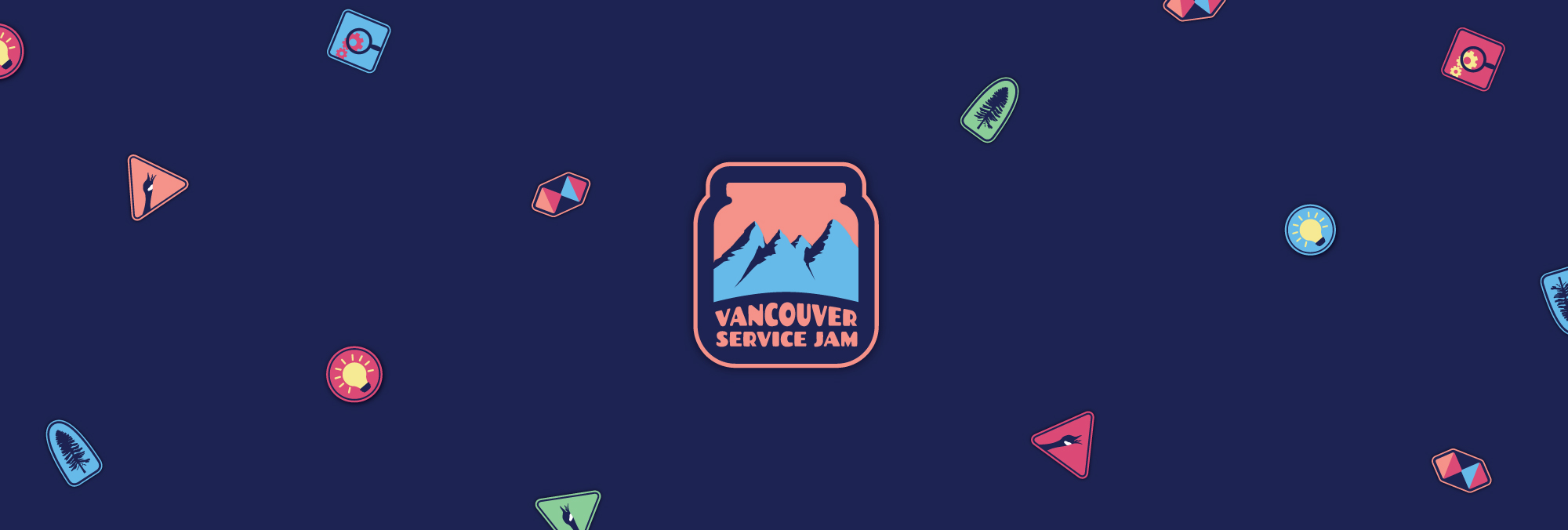
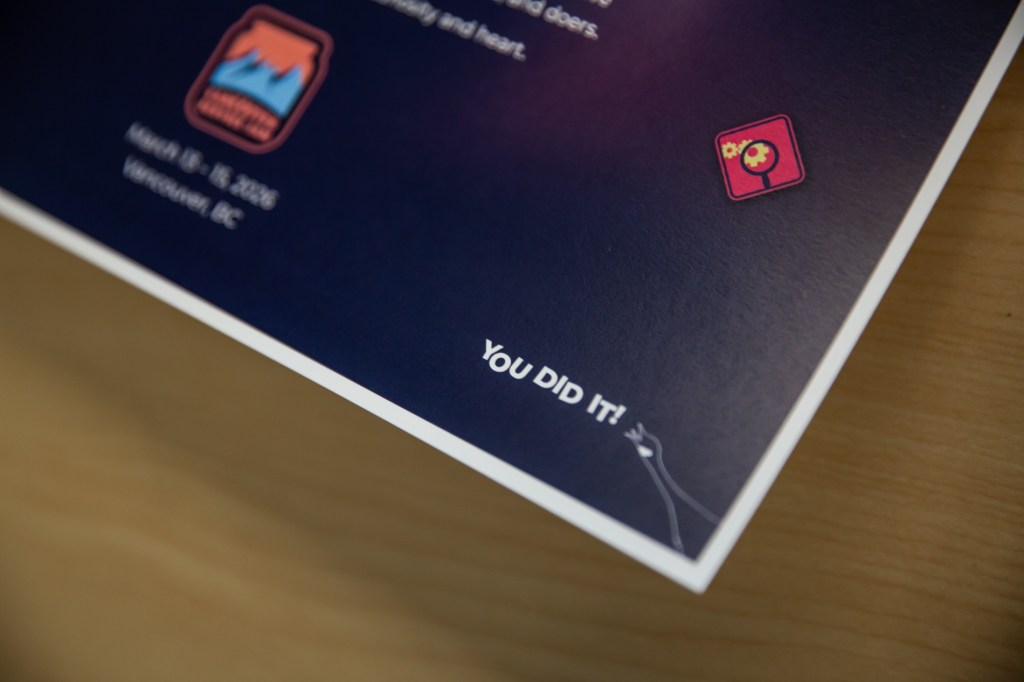
An identity reminiscent of hiking patches and scout team work—rooted in a spirit of collaboration and the freedom to explore and experiment that one thought was lost to our childhood years, with the jar acting as a door to a wider world, as well as a border. A digital patch/sticker system that ensures a versatile logo that can sit atop other elements while looking intentional, as well as alternative stickers or patches that can amplify or clarify the context for social posts and other peripheries. Additional ‘patches’ include a double diamond (a core process in service design), lightbulb, research, spruce tree, and Canadian goose, which ties back to the landscape of the primary logo, with a comical, fun edge.
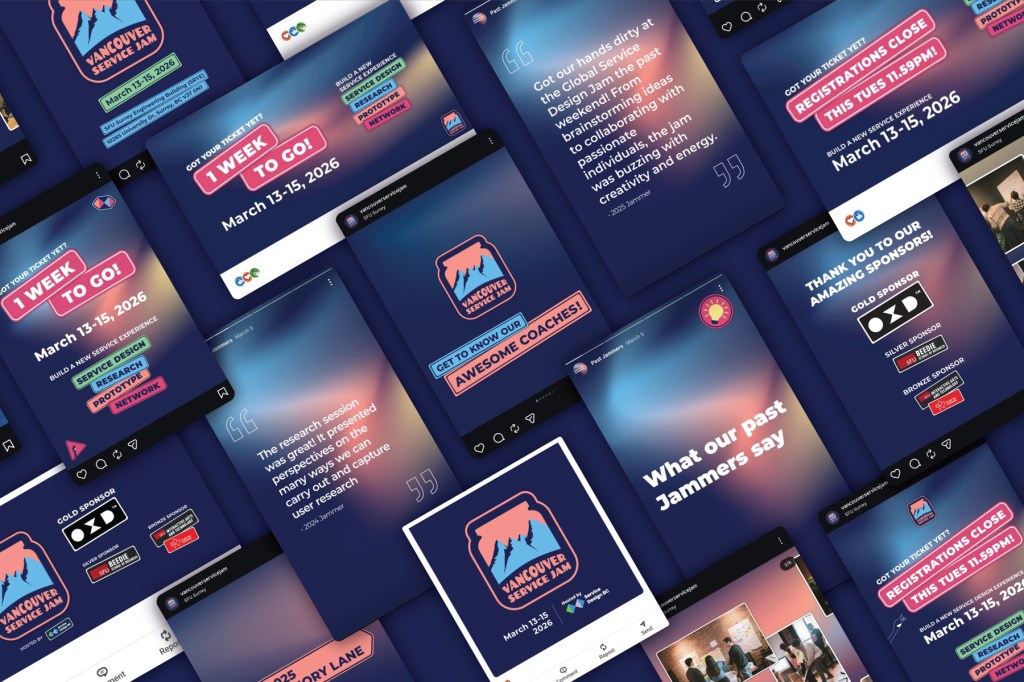
On top of digital/social media assets the event required several presentation slides, promotional and informational posters, certificates of participation, name tags and thank you cards.
THE POSTERS
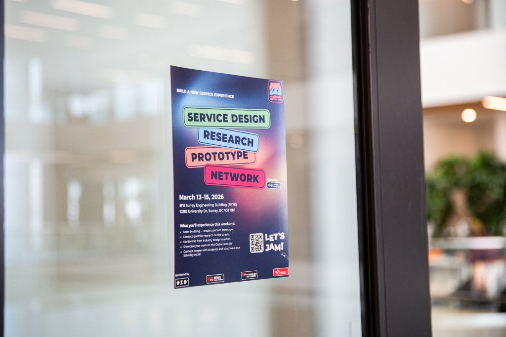
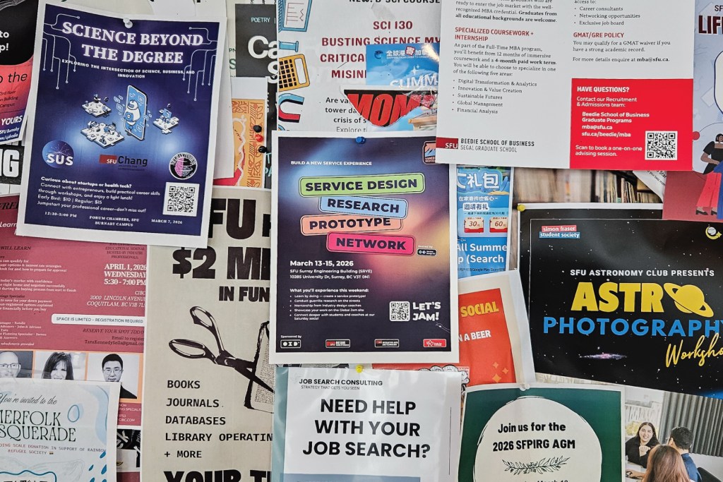
The promotional posters (due for the walls of Vancouver’s universities) went through several iterations based on feedback gained from members of the organising committee who obtained valuable, direct insight into the values of the student demographic. Overall students wished to know more about what they would gain from this event so I put a spotlight on some keywords and designed around the purpose of outlining the event itinerary while visually grounding the design in the ‘sticker/patch’ style. Colours were used liberally and strategically in order to stand out on university walls that I was warned were already filled with existing posters.
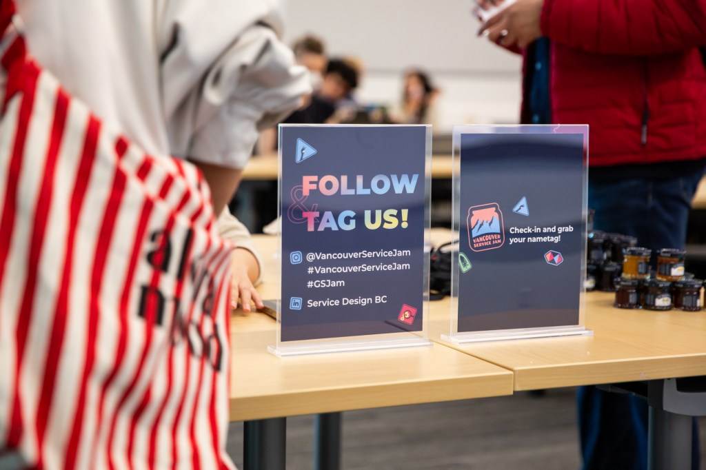
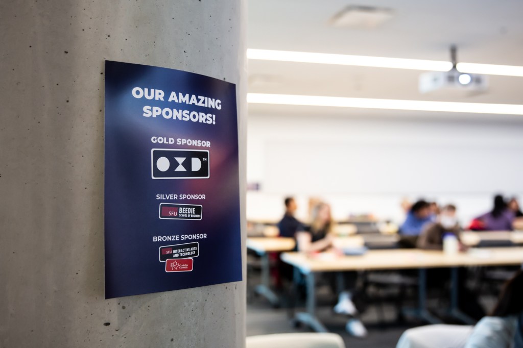
On the day information such as event sponsors, and social media handles and hashtags were crucial so these were designed moreso grounded in the branding colours, excluding the sticker style, in order to differentiate them from the rest of the branding material around the room.
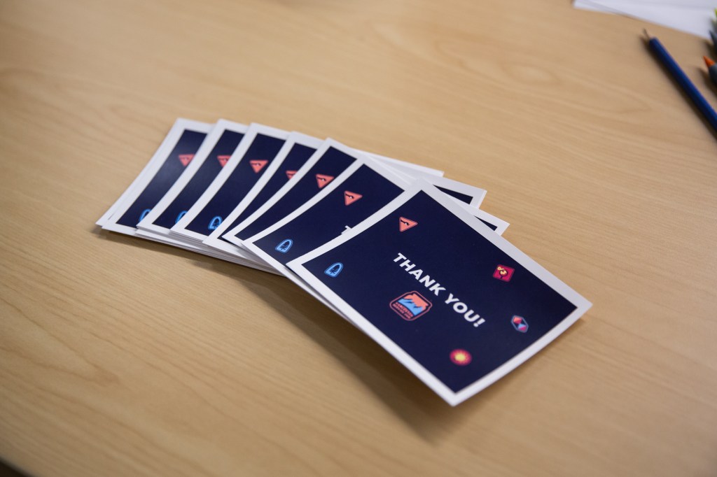
THE PRINTED MATERIALS
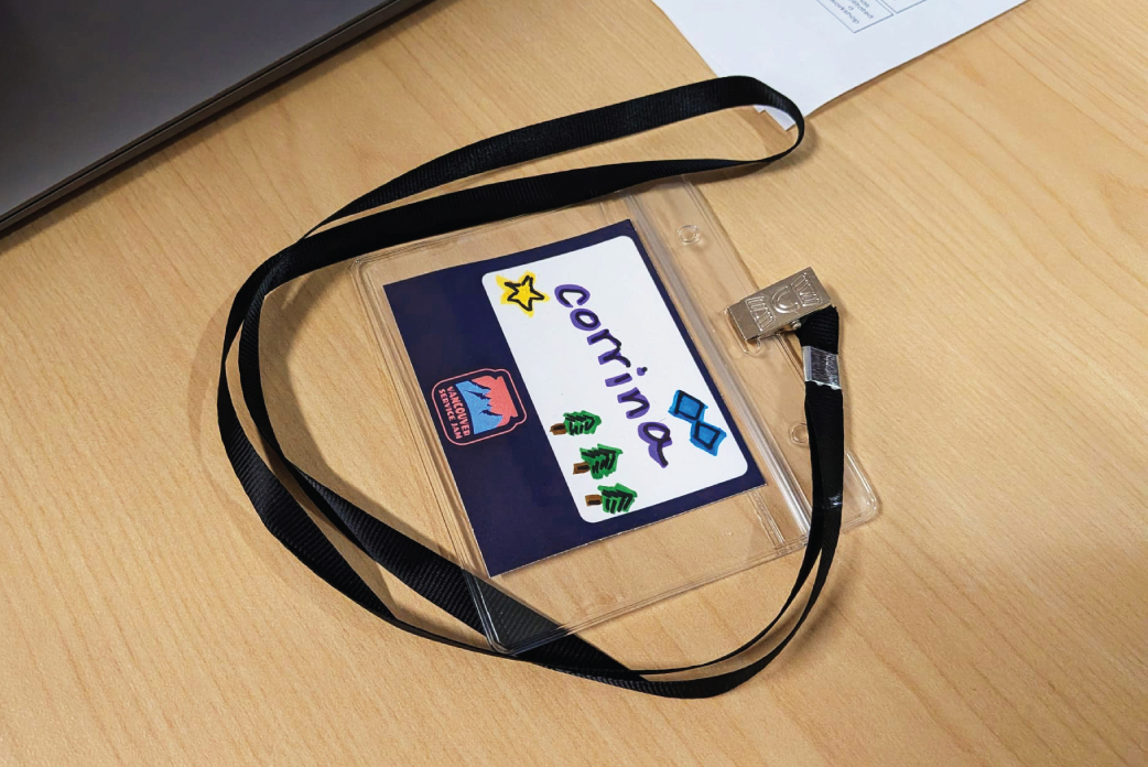
Having seen other events feature customizable name tags, I suggested a similar approach for these and the client agreed that it would fit the playful, human aspect of the event and potentially help with breaking the ice on Day 1. The final name tags were kept very simple with plenty of white space for participants to write and illustrate as much as they wanted with the coloured markers provided.
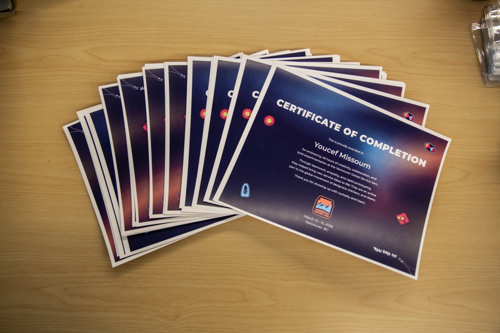
The thank you cards and certificates were distinctly more personal, marking participant achievements and, with handwritten notes, were a very human way to for the organising committee to connect to the participants and coaches. Therefore, it only made sense to use all of the sticker assets, injecting the sense of teamwork, experimentation and playfulness that were a persistent presence throughout the event. Even the goose, on the loose and screaming offset type, made a final, enthusiastic yet subtle congratulatory appearance on the certificates.
THE PROCESS
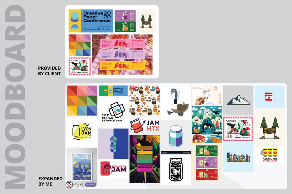
After sending a few images to give an initial idea of what kind of vibes the client was after, I expanded on the existing images and divided them into approximately 3 overall ideas: minimal/flat with strong colours; geometric shapes and icons; and (playful) personality-forward, whether that be via a mascot or an inanimate object/theme.
The keywords to explore were: teamwork, fun, playing/experimenting, pushing boundaries, problem-solving and design thinking. Unable to find a goose character that was adequately fun within the confines of jar interactions, I also illustrated my own with its head stuck in a jar.
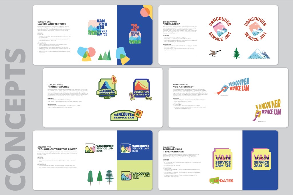
THE CONCEPTS
Mountains were the main landmark I applied throughout my ideation and I expanded each general idea to 2 tangible logo ideas each, overall exploring paying and experimentation (concepts One and Two), teamwork, problem-solving and fun (concepts three and four), and pushing boundaries and experimenting (concepts five and six).