BRAND IDENTITY DESIGN
GREENLIGHT SYSTEMS
A company with years of experience and ground breaking technologies, Green Light Systems prides itself on its intuitive interfaces with a primary app that helps its corporate users make any kind of list they would ever need.


LOGO REQUIREMENTS
They wanted a blue, abstract logo that represented their years of expertise and consideration for their wide demographic net.

THE RESULT
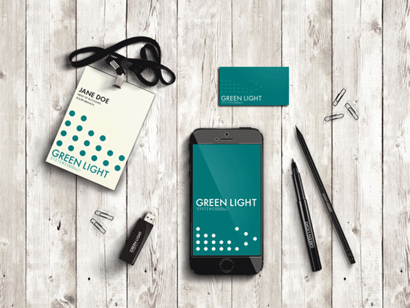
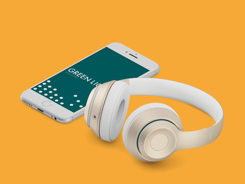
The faithful dot, a geometric wonder that can represent unity, list points and in this case, a group of them can form the trusty writing tool. In this project the abstract element can be framed in a range of ways to create graphic elements, patterns and more for the range of needs a business like this will need.
THE PROCESS
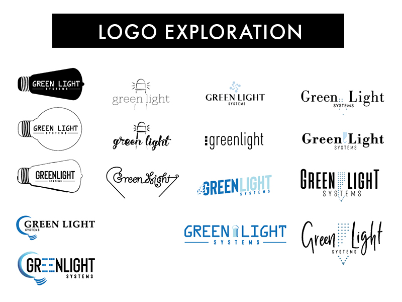
I started with exploring the obvious; light sources, writing sources and then ways to merge the two with the brand name in a way that would allow flexible usage of its visual elements by the client.
In the end, keeping in mind the demographic, future-proofing the legibility of the brand in corporate spaces, I refined these explorations down to the final deliverables above.
